Complete visual redesign of The Weather Network website
.png)
The Weather Network is a popular website that provides weather forecasts, reports and news for major North American cities. They provide around the clock updates to keep users informed and prepared for inclement weather conditions.
As a frequent visitor to the website, I have noted several pain points and limitations that currently reduce user friendliness and could be improved on to maximize viewer engagement and retention. Some of the more prominent issues are listed below.
The current visual scheme is jumbled and inconsistent. Action buttons and hyperlink text are all different colours, making it difficult to identify which items are clickable at first glance.
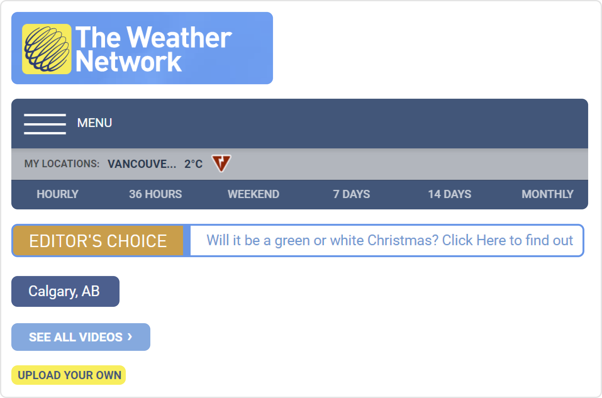
Despite having lots of screen real estate on the full desktop version, the navigation bar is still condensed into a secondary menu requiring extra clicks to navigate the site.
.png)
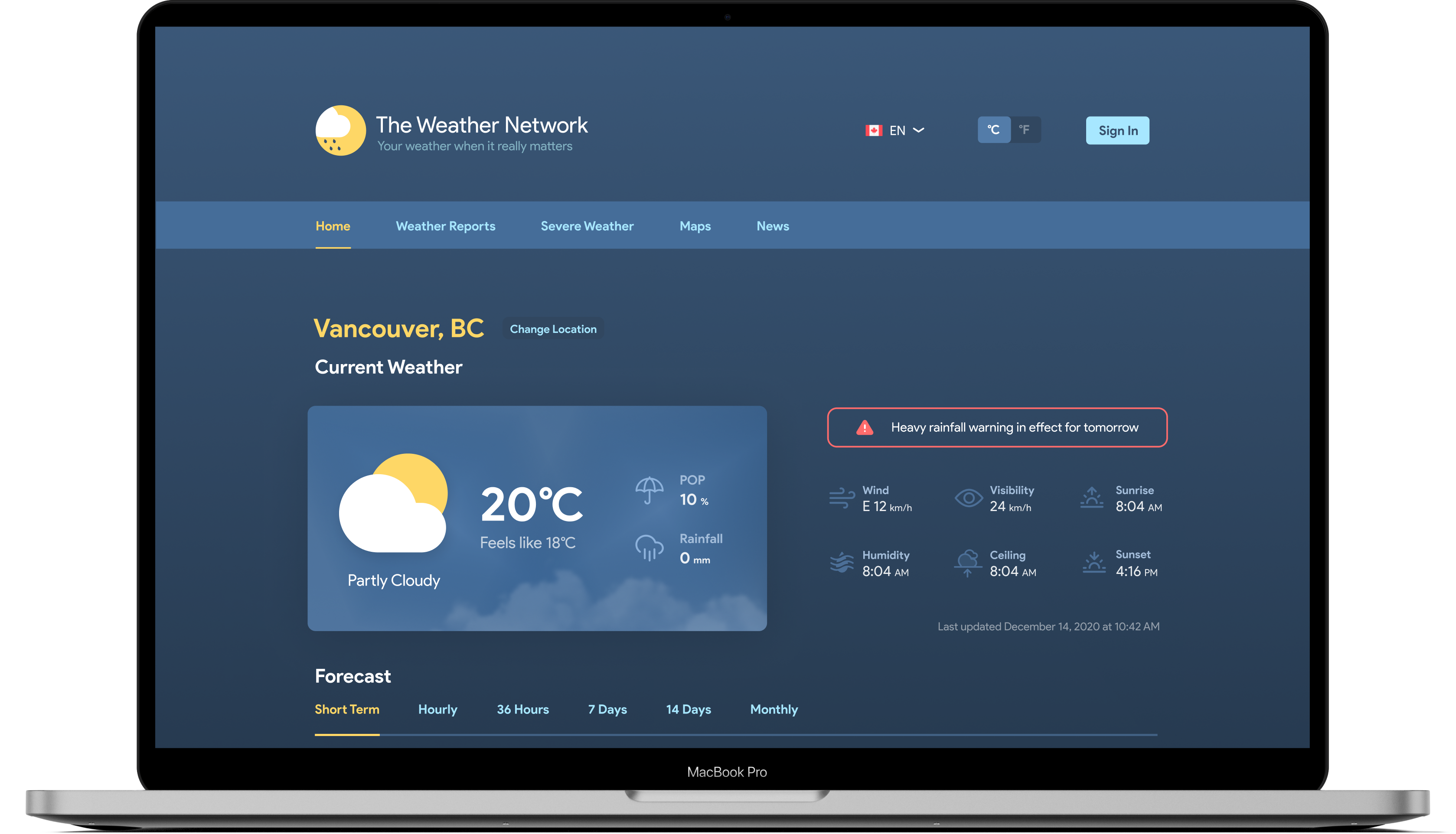
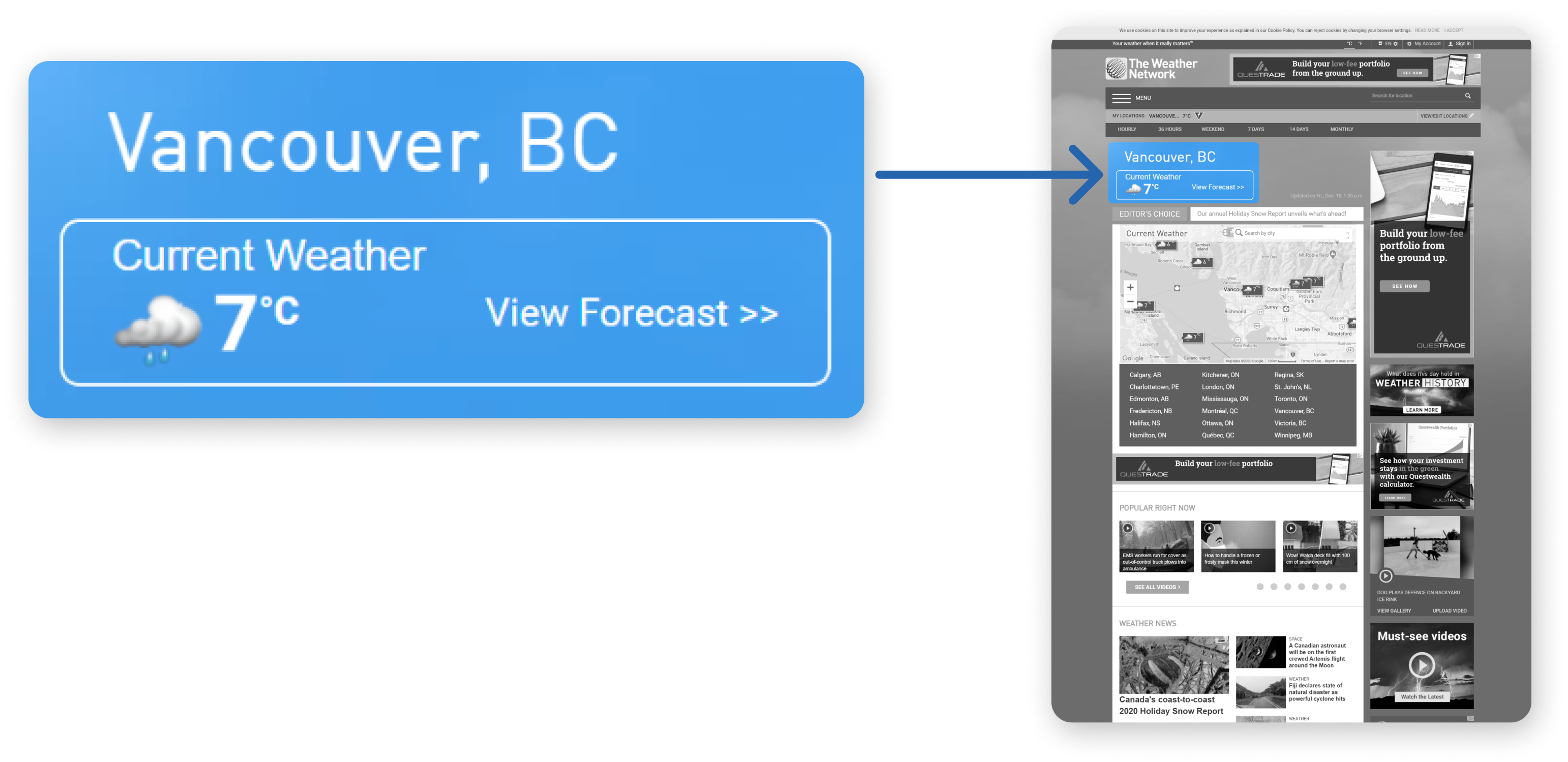
Presently only a small weather widget is displayed on the home page. However, since the primary objective of most users when visiting this site is to view the weather forecast, this should be the main focus.
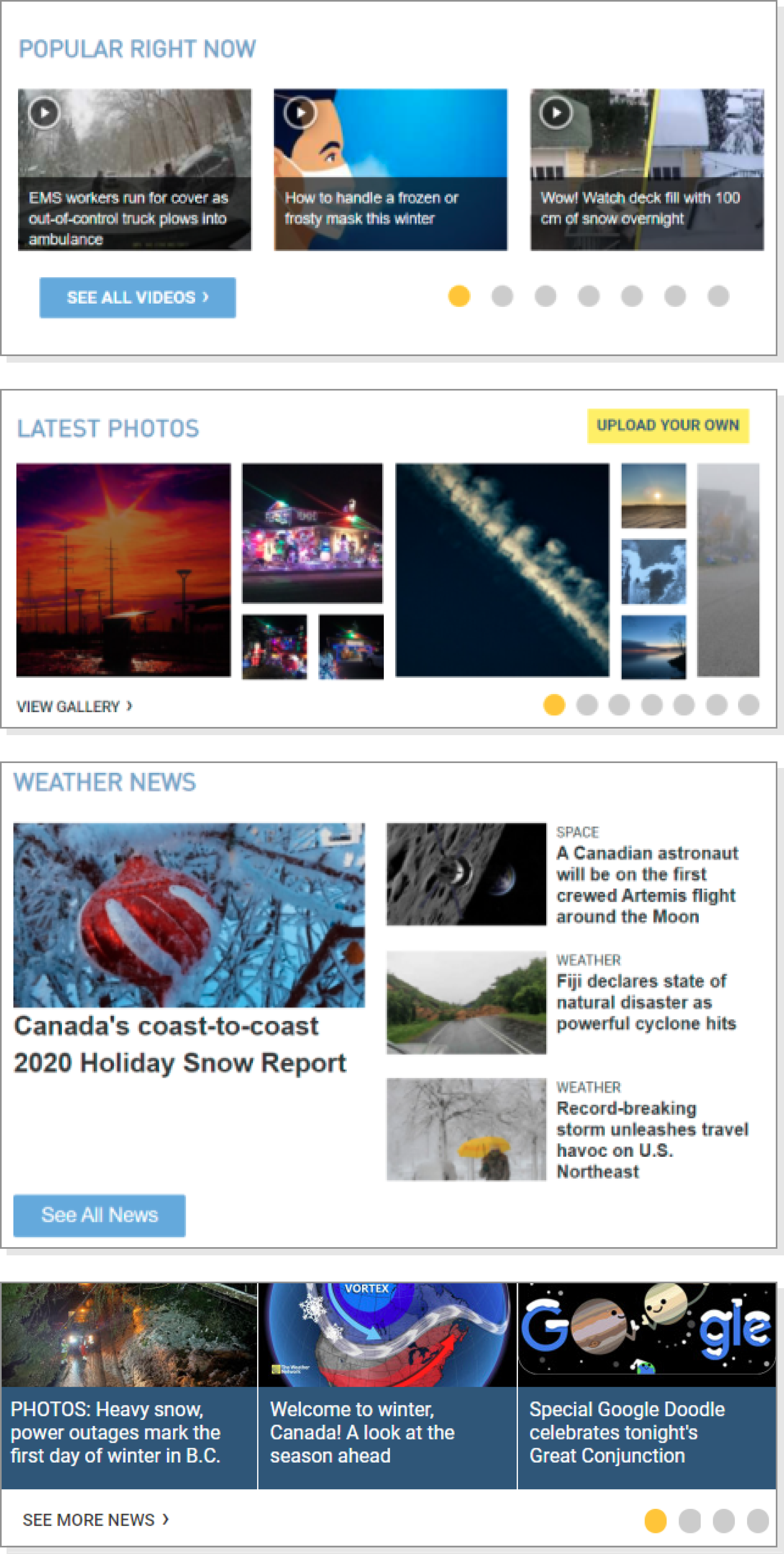
The use of varying sliding carousels and grids for similar content could result in confusion and uncertainty with the site’s interactive elements.
To address the pain points outlined, I identified some objectives as a guide and incorporated these elements into my redesign.
I wanted to keep the colour palette similar to the original website to maintain familiarity with readers who are used to the blue and yellow scheme. I simplified the existing colour palette to be more visually appealing, and defined colours for each specific element, such as action buttons and text.

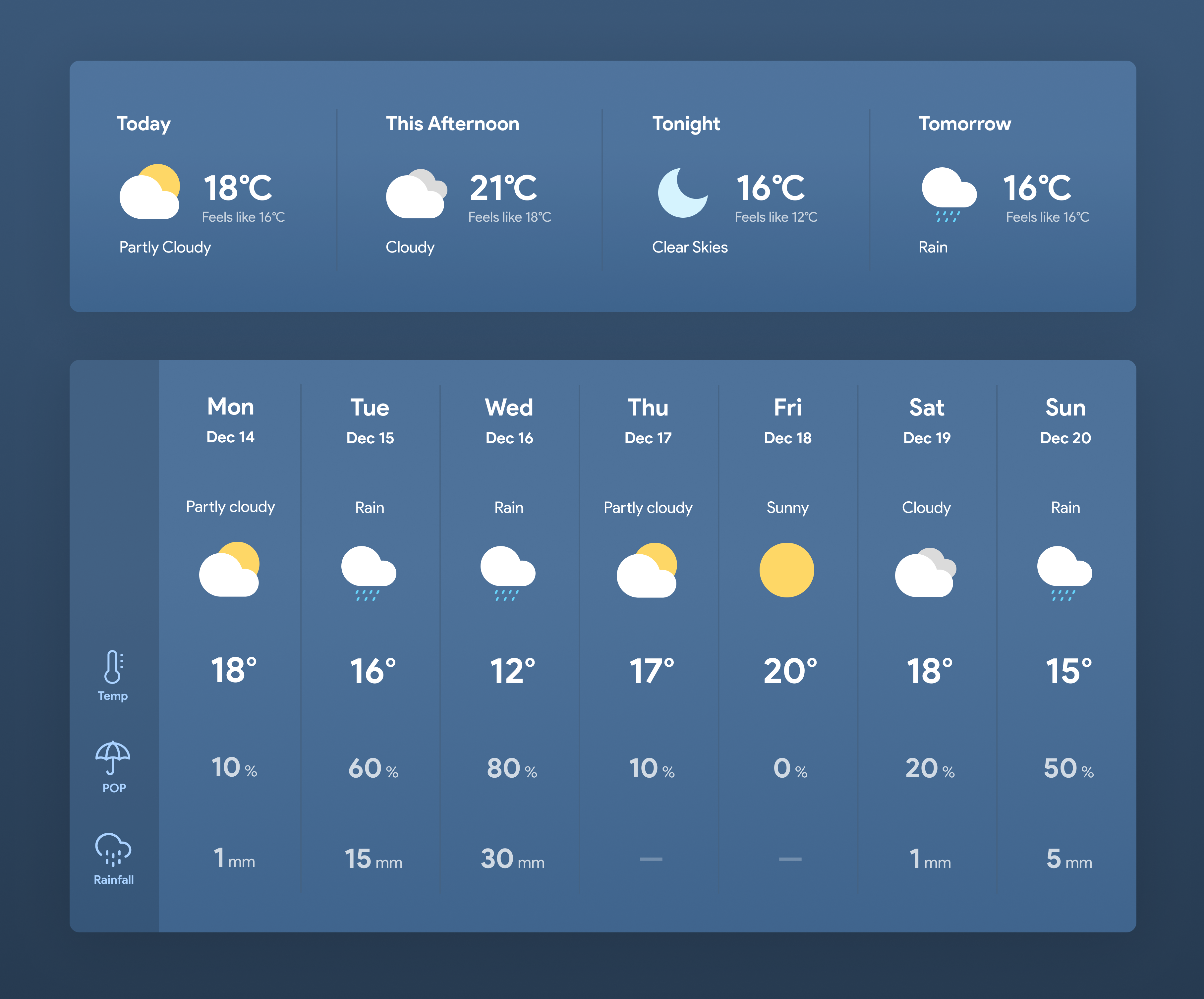
An oversized widget with important weather information, plus a weather forecast preview will be the first things viewers see when they visit the site.
.png)
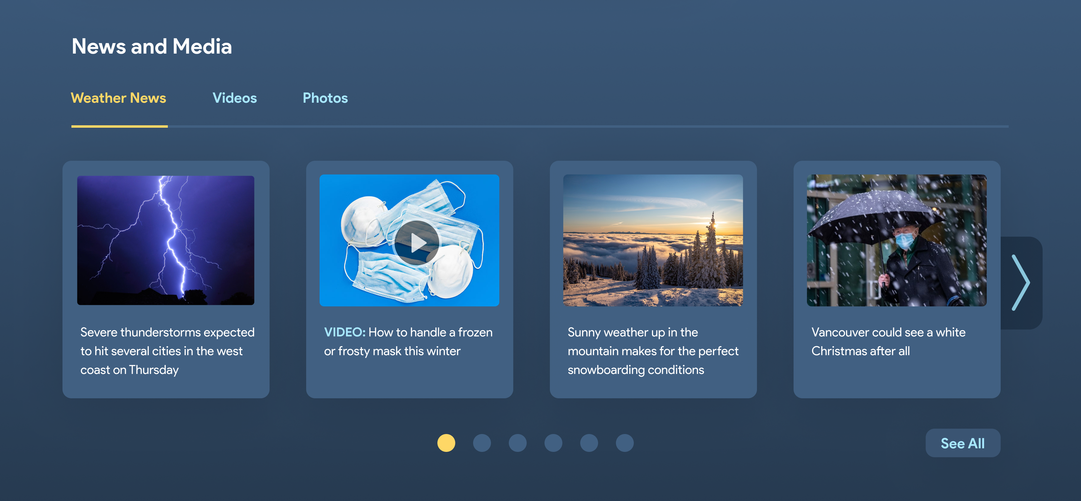
News, photos and videos will be consolidated into one section to save screen real estate and improve organization. The same carousel format will be used throughout for consistency.
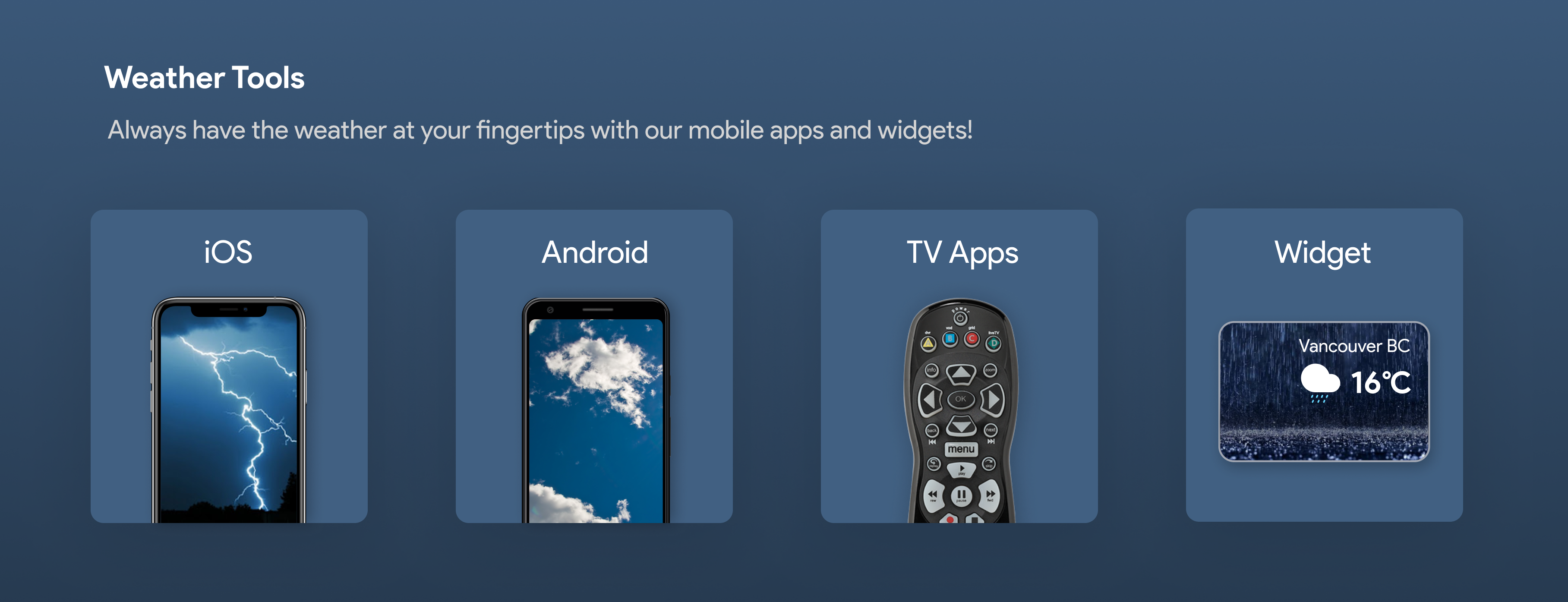
Currently, links to the mobile apps and widgets are hidden in a small section in the footer. These are now more prominently displayed to increase the likelihood of the user navigating to the apps and trying them out.
A simplified layout highlights the important forecast information for readers
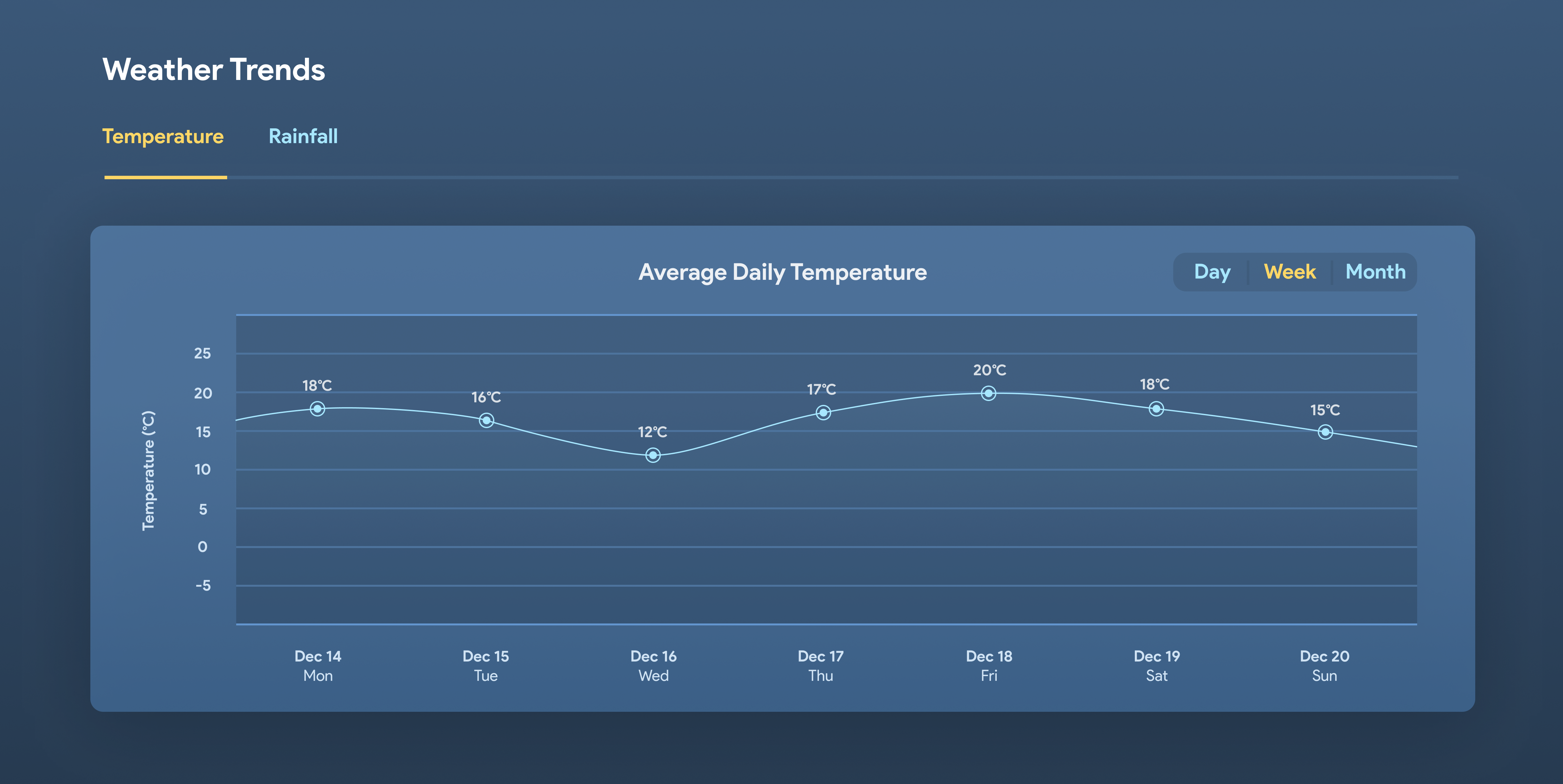
Visual representation of weather information in the form of graphs make it easier for readers to view and see long term trends at a glance
.png)