Easily schedule and trade shifts with your colleagues
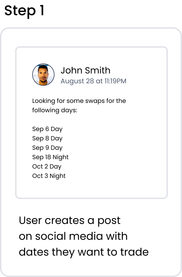
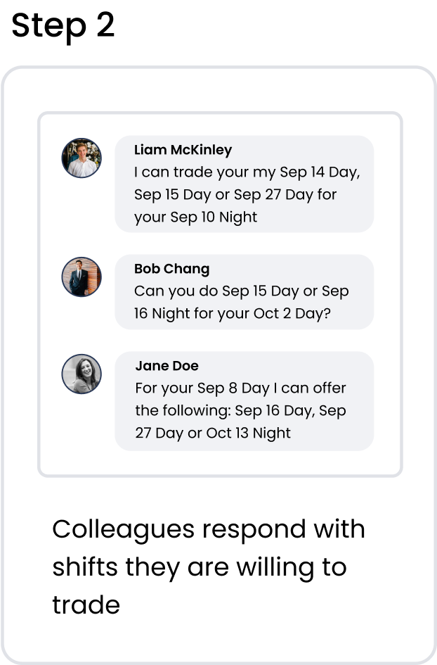
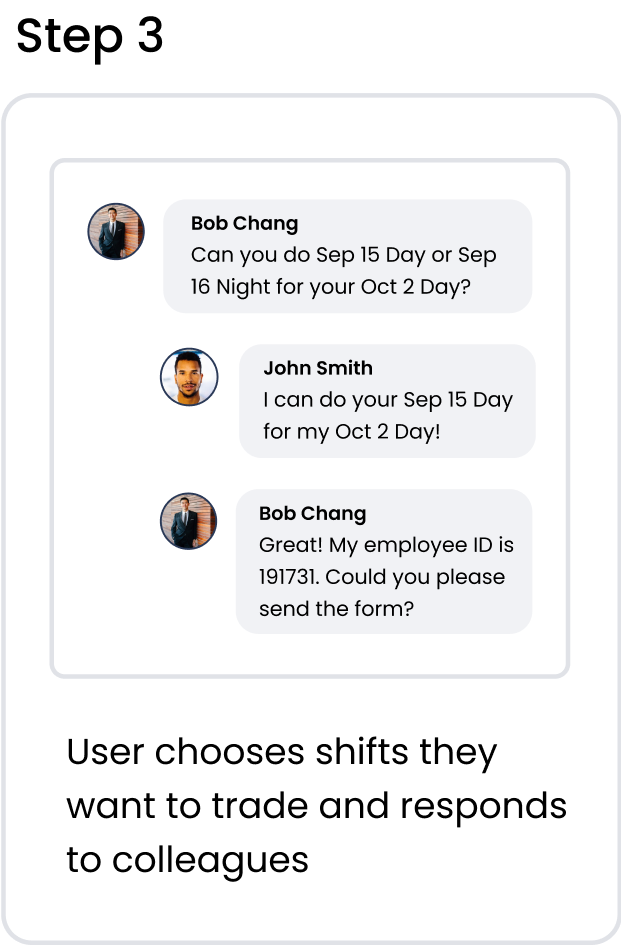
Shift trading plays a crucial role for nurses and other healthcare staff to be able to maintain a decent work life balance when they do not have set weekends and holidays. Currently, the most commonly used method of trading shifts is a convoluted process that involves using social media, messaging apps, and e-mail/fax to complete a trade.
.png)

There are many opportunities for error to arise with this method. With so many different methods of communication required, it is easy for mistakes to be made, which can result in employees showing up when they’re not supposed to, or failing to show up for work. After hearing my colleagues speak about the difficulty of trying to find people to cover their shifts, this led me to my initial question:
The all in one tool for nurses and other healthcare workers to track their schedule and find colleagues to trade shifts with. Users can connect with their colleagues by joining their workplace group, then post shift trade requests and view the requests of others. The shift trade process is handled automatically, negating the need to manually send requests to the manager or staffing coordinator. Once the shift trade is approved, it is instantly updated in the user’s schedule, minimizing the risk of error.
There are numerous apps on the market for nurses to keep track of their schedule and shift trades. Shift Worker and MYDUTY are two of the most popular. The top features of these apps include:
After speaking with colleagues who regularly use these apps, I identified some pain points.
The goal of this project is to create a product that allows the user to easily track their work schedule and trades while streamlining the process of trading shifts with colleagues. Based on the pain points above, I identified areas of opportunity and outlined the following objectives for our project:


To gain better insight into the current experience of shift trading, I interviewed my colleagues at the hospital.
I found that a large number of them encountered some form of miscommunication during one or more of their shift trades leading to confusion that sometimes resulted in “no shows” or showing up when they were not scheduled to work. Most commonly, these errors included:
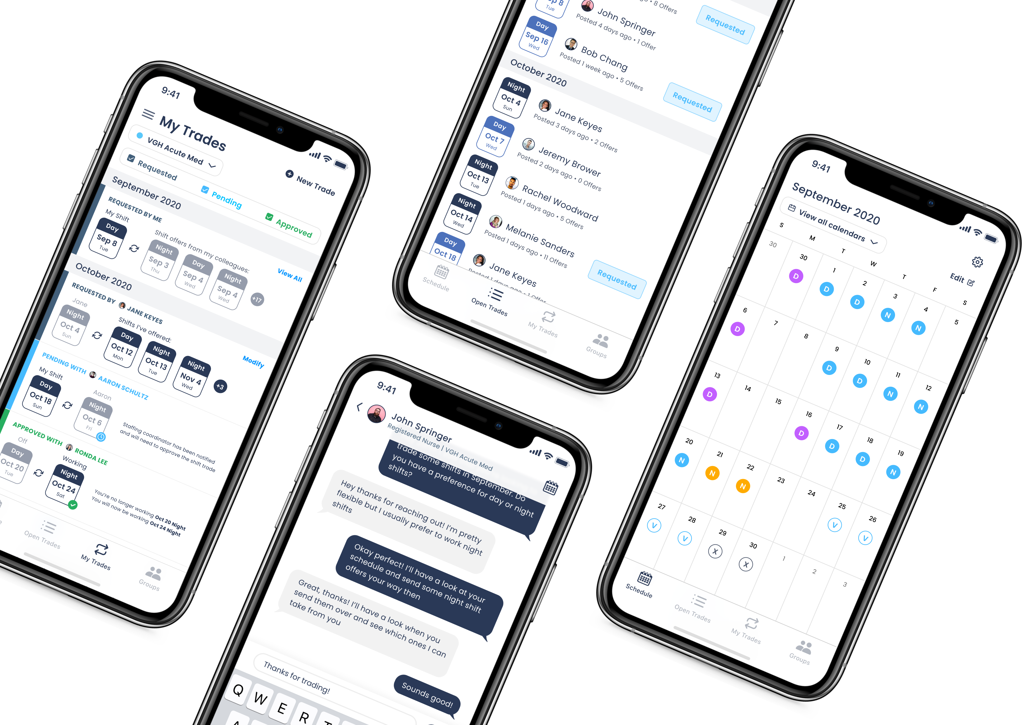
With the pain points and project objectives in mind, I developed the product structure. The app is divided into 4 main features.
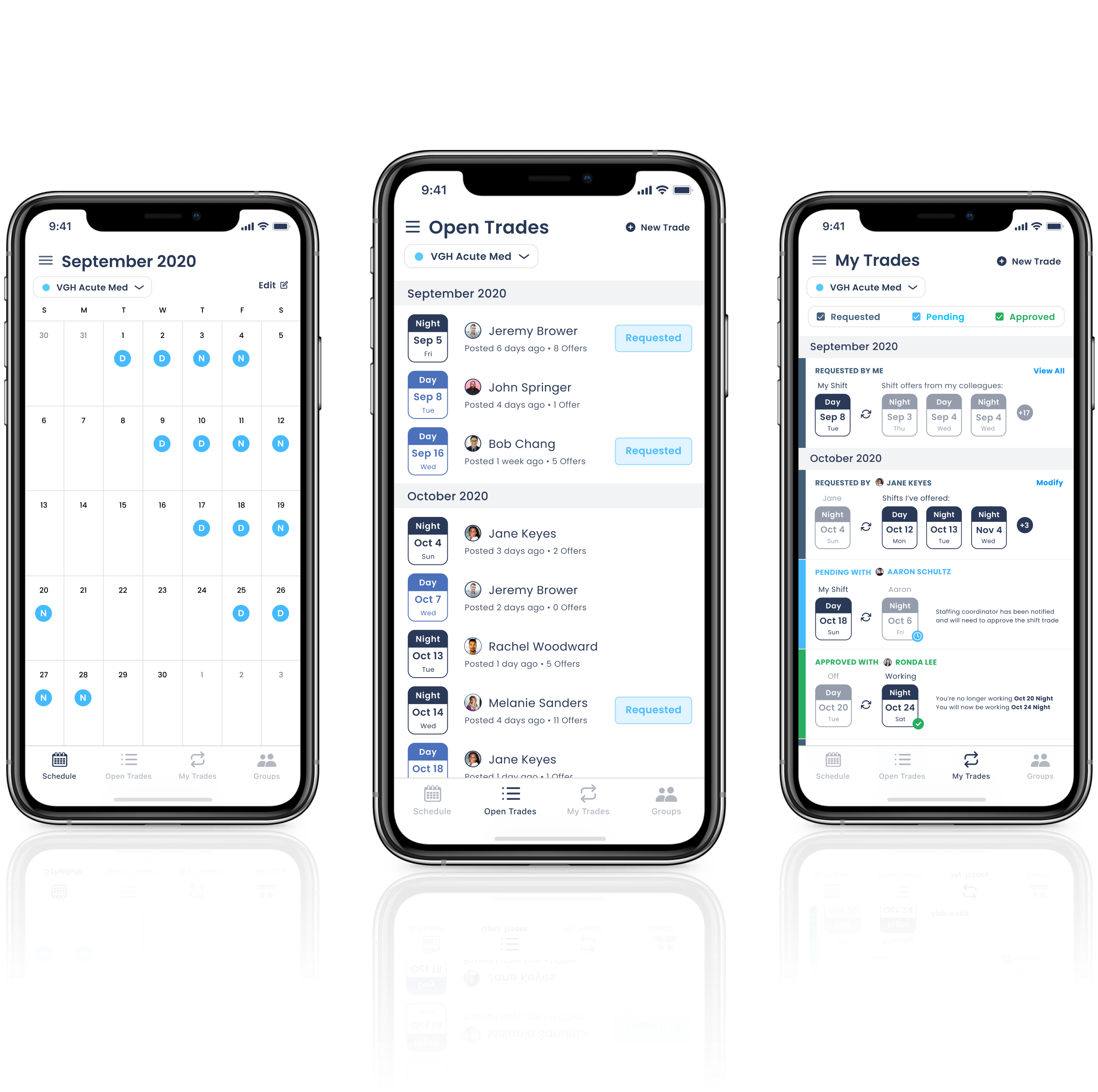
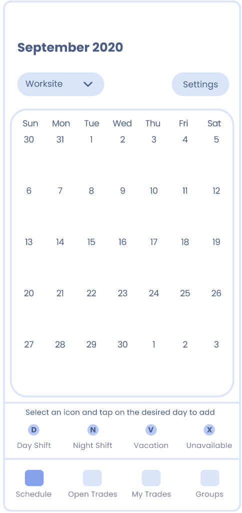
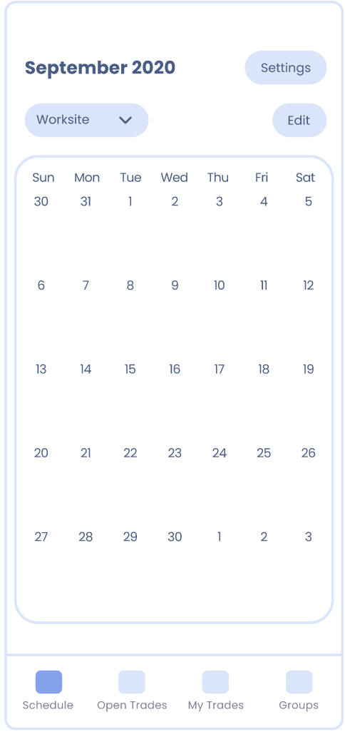
Schedule: The user can create and view their work schedule in the calendar, and track their schedule for multiple worksites. Vacation dates can be marked, as well as dates they are unavailable so that their colleagues know not to offer shifts on those days when performing a shift trade.
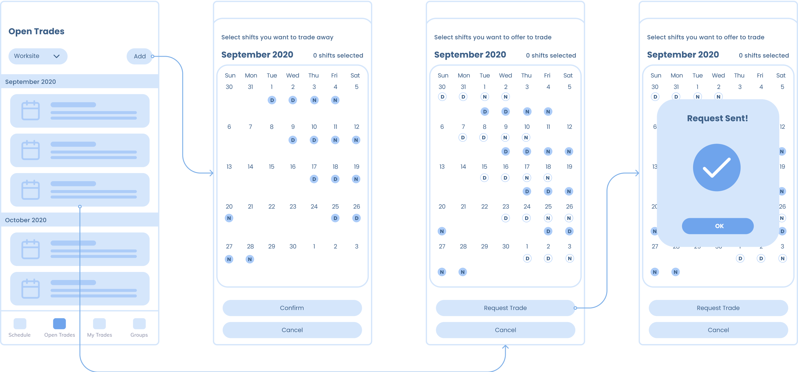
Open Trades: View all shift trade requests that colleagues have posted, or create their own new shift trade request. Selecting a colleague’s request will give the user the option to choose shifts from their own schedule to offer to trade.
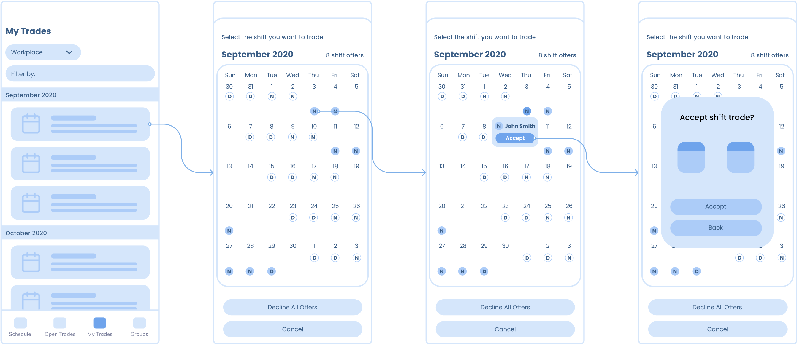
My Trades: See the status of in-progress shift trades, and respond to colleague’s offers for shift trade requests that the user has posted.
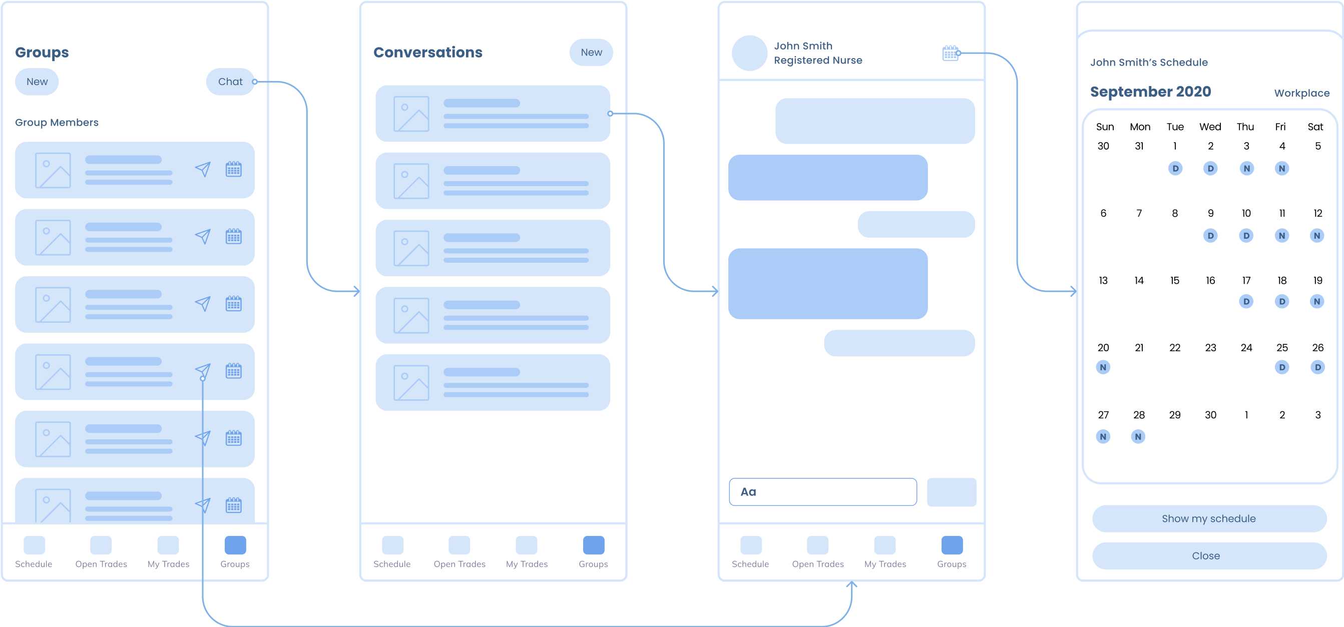
Workplace Groups: Join workplace groups that the user is a part of, or create new ones. Within each workplace group, they can view the group members, send colleagues a message and view their work schedules.
.png)
I brainstormed some ideas and then created mockups of the four main features which highlight the main layout and flow of the app. I first sketched out the ideas on paper, and then translated the sketches into wireframes.
I explored several different methods for a user to input shifts into their calendar, to see which method would be the most intuitive and easy to use. I experimented with existing calendar apps and came up with some possibilities.

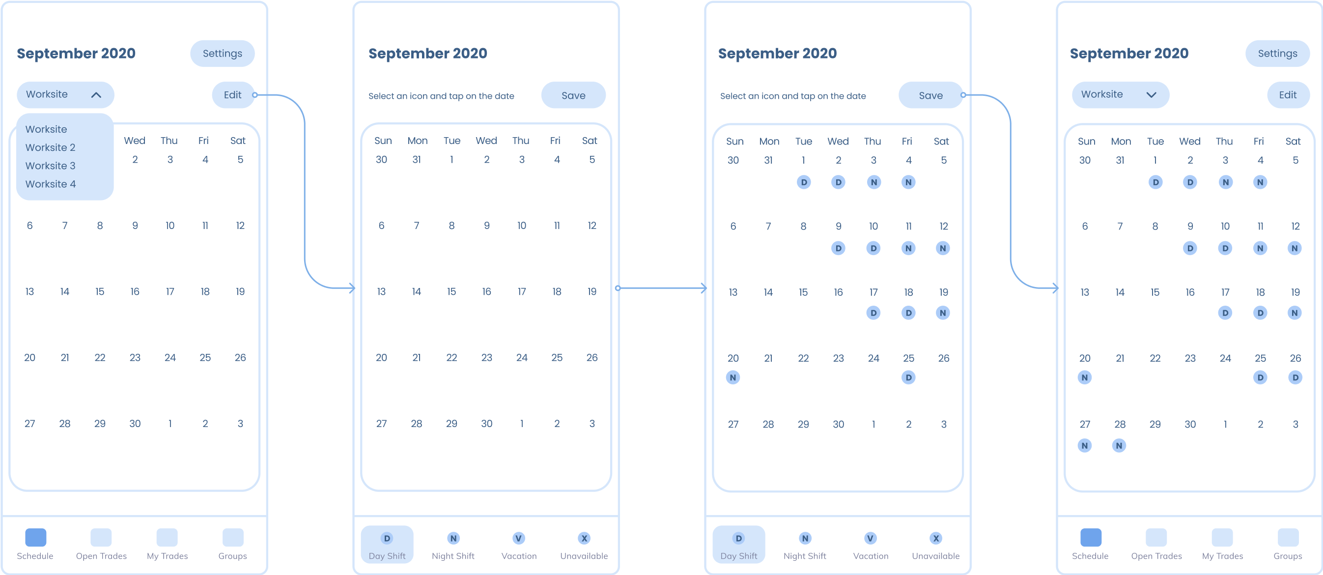
Add shifts by tapping on the date, which would open a context menu where the user could select the shift they wanted to add.
Pros:
Cons:
Icons are located in a static row below the calendar, so that users could select the desired shift and apply it by tapping on the appropriate dates, or tap on a date to remove the existing shift.
Pros:
Cons:
To alleviate the problem of users accidentally adding shifts when trying to view the calendar, a separate editing mode was added. To add shifts, a user goes into the edit mode, which changes the bottom navigation bar into the shift icon selection menu. From there, they can choose the desired shift icon and tap on the dates they want to add it to.
Pros:
Cons:
Initially, I was concerned that having both a “view only” and “edit” mode for the calendar would be unintuitive and confusing for users. However, after conducting usability testing and consulting with colleages, I found that the majority had no issues navigating to the edit mode to add shifts. Furthermore, I was reassured to find that they also preferred having a seperate editing mode to prevent unintended adding or removal of shifts (for example when they are trying to swipe the calendar to see a different month and accidentally tap on a date instead) which could cause confusion when viewing the schedule.
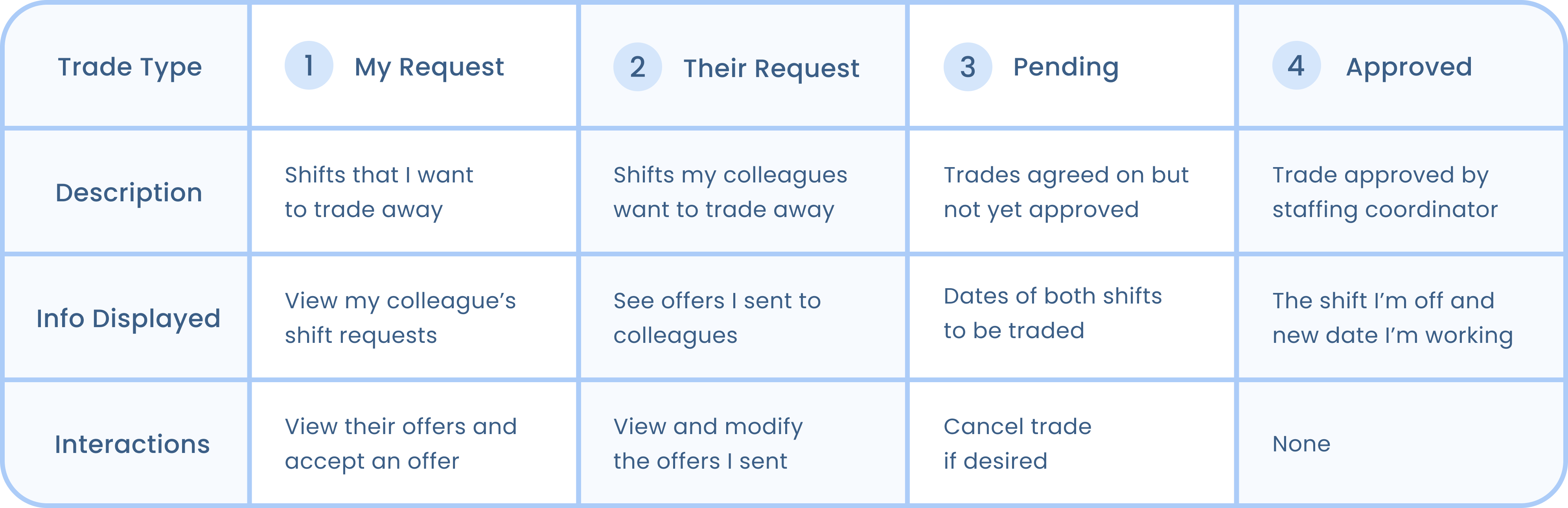
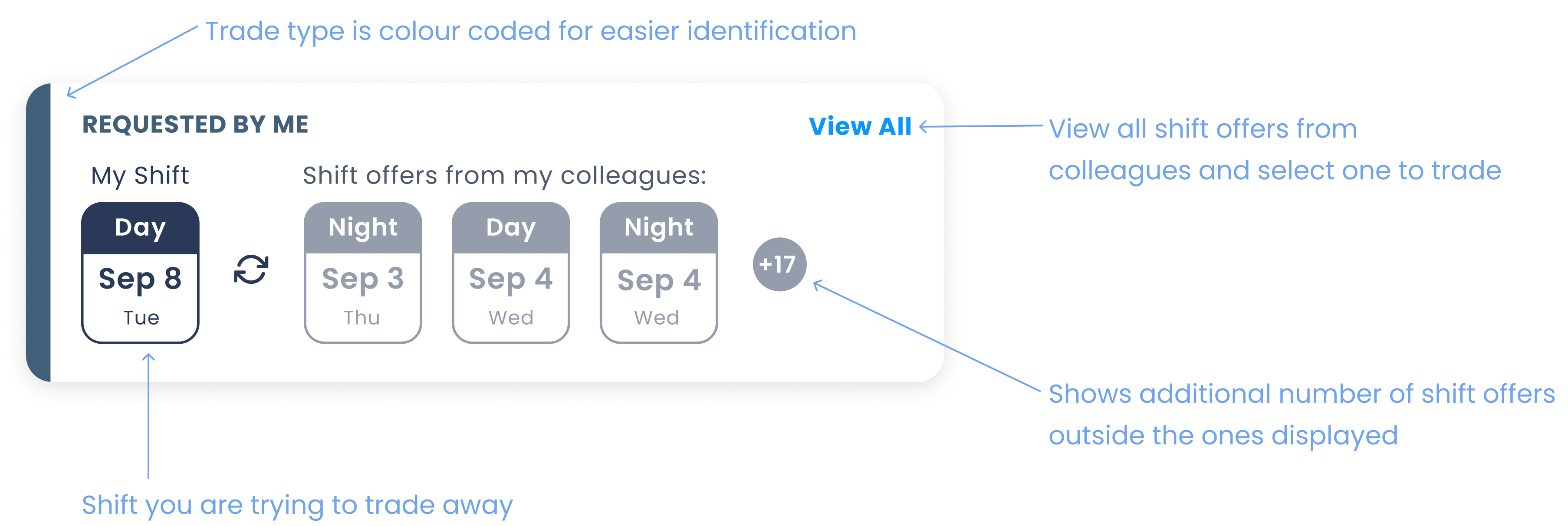
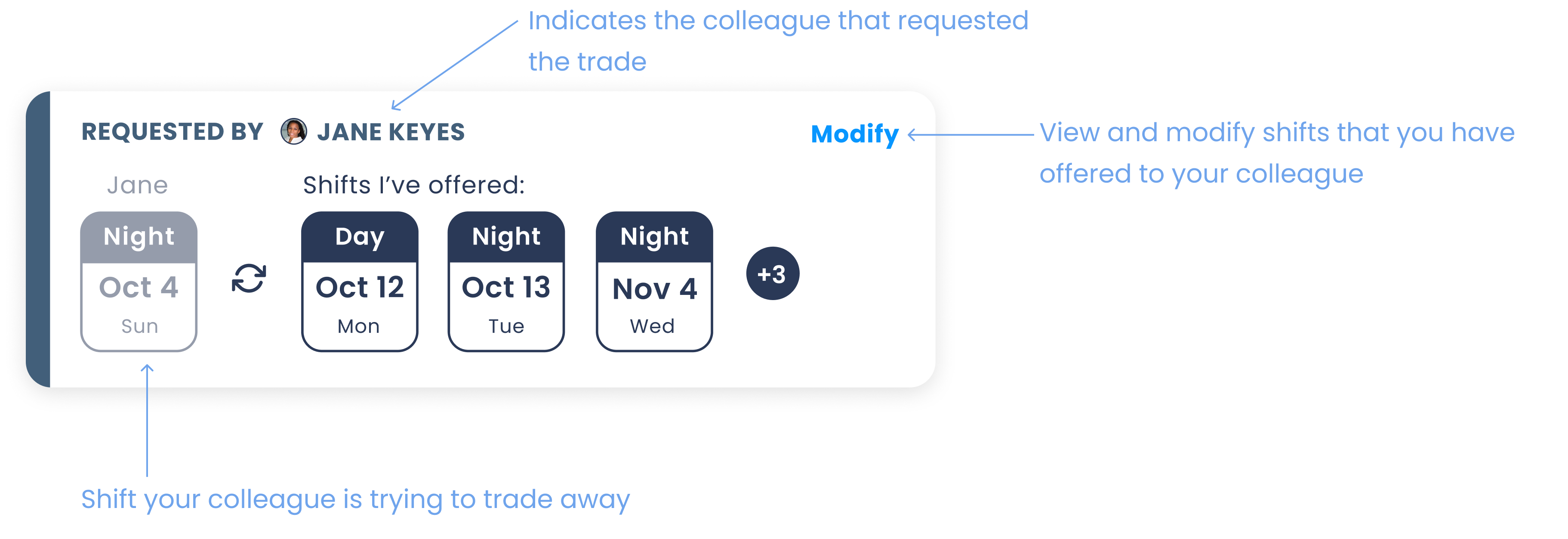
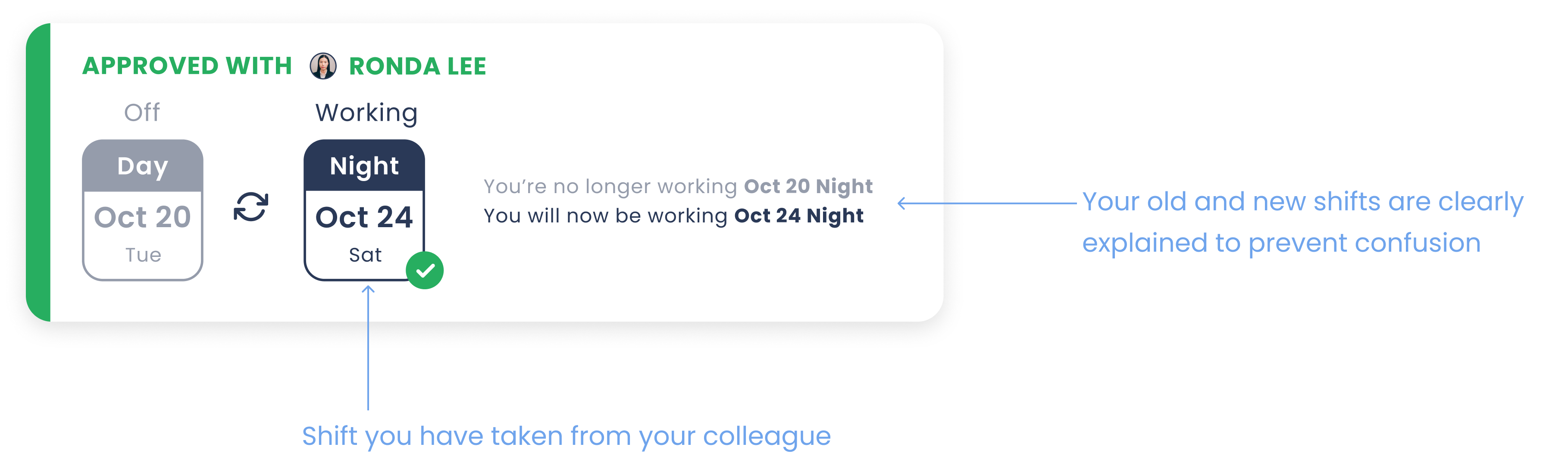
One major challenge for me when designing this app was figuring out how to display the different types of shift trades in a way that would be easily understood by the user. To begin, I first determined all the different types of trades possible. I decided to categorize by 4 main types of shift trades the user would see, and defined unique user interactions appropriate for the type of trade:
I then explored the different possibilities of displaying all this information, including various lists and grids, to see which one would work best.
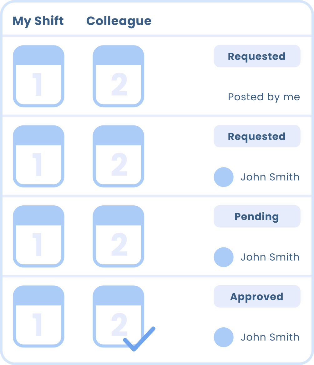
Pros:
Cons:
I initially tried a compact list for it’s simplicity and easy readability. However, user feedback indicated that it was difficult to differentiate between the types of trades. The shifts they were trading away and the new shifts they were working are also not clearly identifiable.
Pros:
Cons:
I also tried displaying the shift trades in a grid format, since it allowed the unique user interactions to be prominently displayed as buttons. However, the grid made the information appear cluttered, and users found all the different buttons displayed overwhelming.
Pros:
Cons:
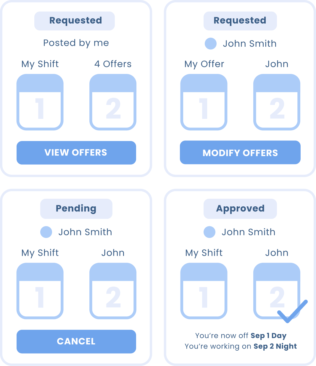
I improved on the original list design by expanding each list item into cards so that additional information could be added that would better allow the user to understand the different types of trades, and the possible interactions available. Having more space within each card also meant that I could show a better preview of the shifts that have been offered.
After considering the different possibilities and testing with users, I decided on placing all this information in card format, arranged in a list. The final designs are shown below.
.png)
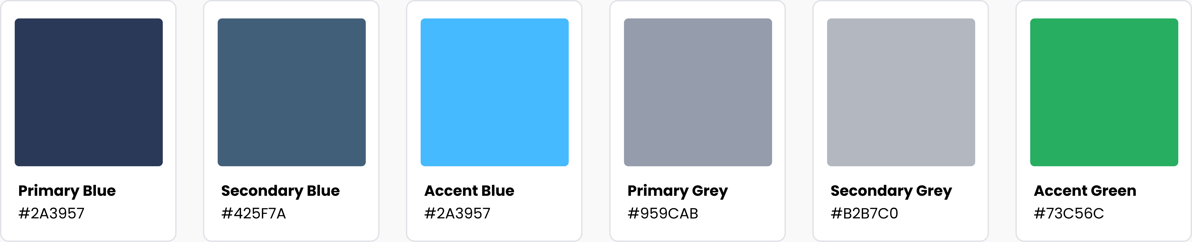
I wanted to find colours that healthcare workers, my target audience, would be familiar with. I performed research of healthcare branding design and found that the most prevalent colours used in healthcare logos were blue, green, and grey, colours which appeared clean and invoked a sense of competence, knowledge and trust.

Using the above palette for inspiration, I created my branding scheme that would create a sense of familiarity with healthcare workers while still maintaining a high contrast ratio for legibility.
Poppins
1 2 3 4 5 6 7 8 9 0
Aa Bb Cc Dd Ee Ff Gg Hh Ii Jj Kk Ll Mm
Nn Oo Pp Qq Rr Ss Tt Uu Vv Ww Xx Yy Zz
.png)
Easily create your work schedule by tapping on the dates you are working, with the ability to keep track of vacation dates and dates unavailable to work as well. For those that work in more than one location, multiple schedules can be added which are colour coded.
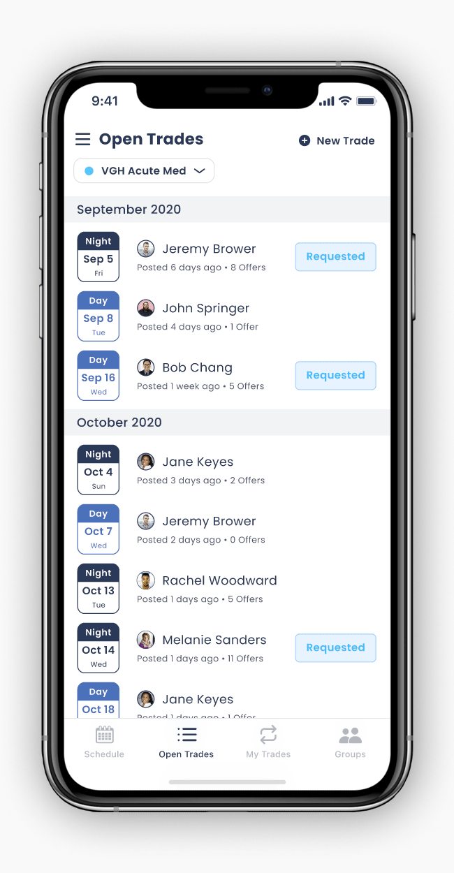
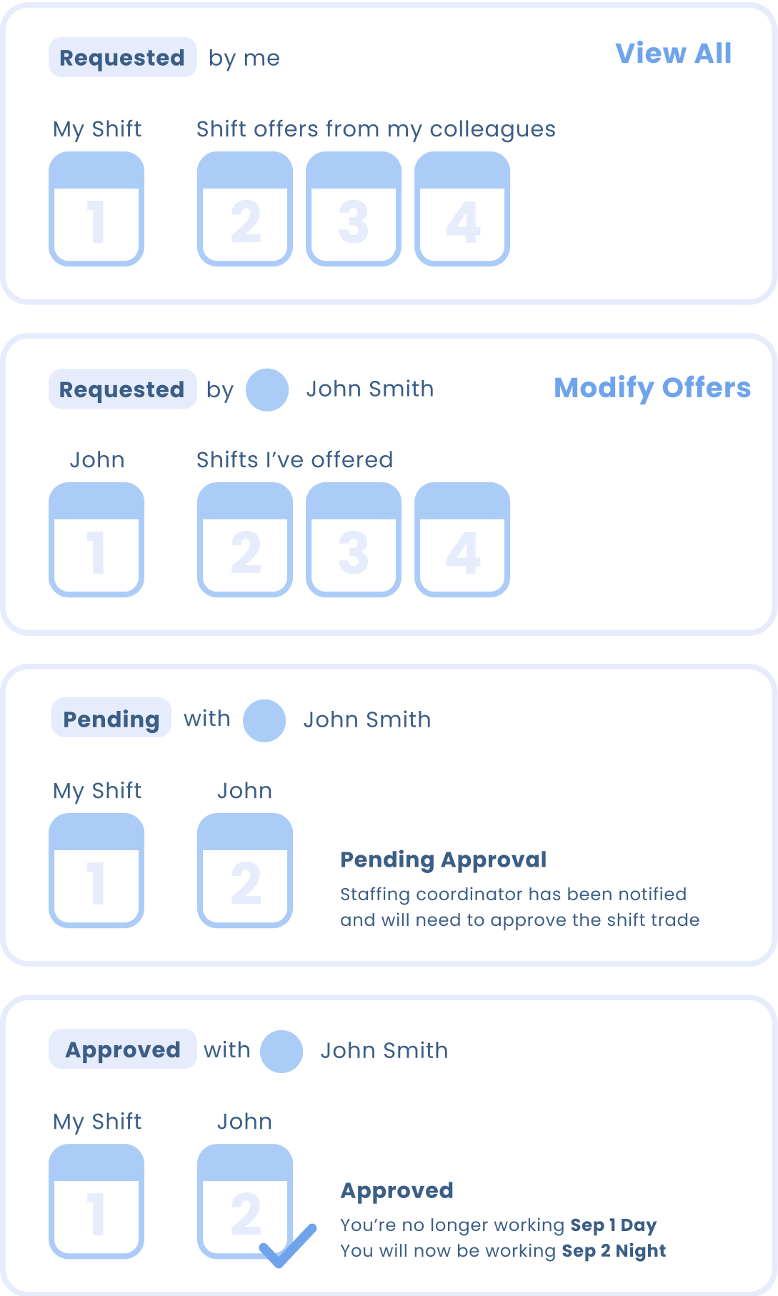
Post the shifts you want to trade off for your workplace colleagues to see, and view shift trade requests that your colleagues have posted. By selecting a colleague’s request, you can view both of your schedules, where you can select shifts from your own schedule to offer.
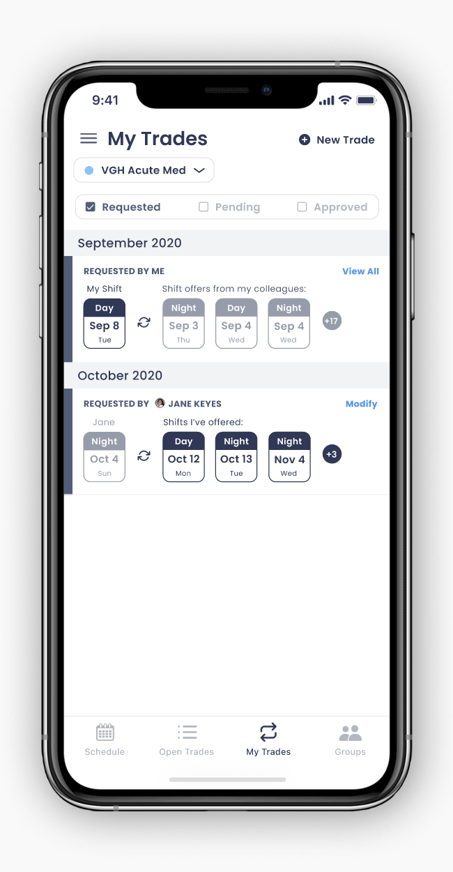
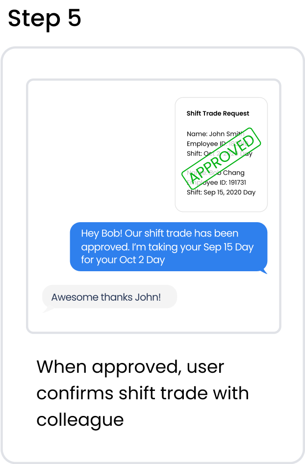
View the shift offers that your colleagues have sent you and accept an offer to initiate the shift trade.
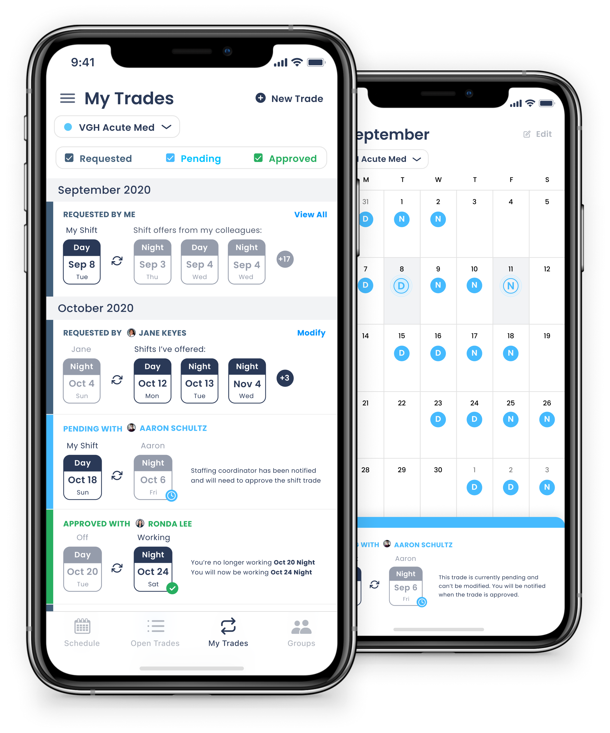
See the status of your shift trades, and get notified when a trade has been approved by the staffing coordinator or manager. Approved shift trades will be automatically updated in your calendar. Pending shift trades are marked in the calendar for easy identification
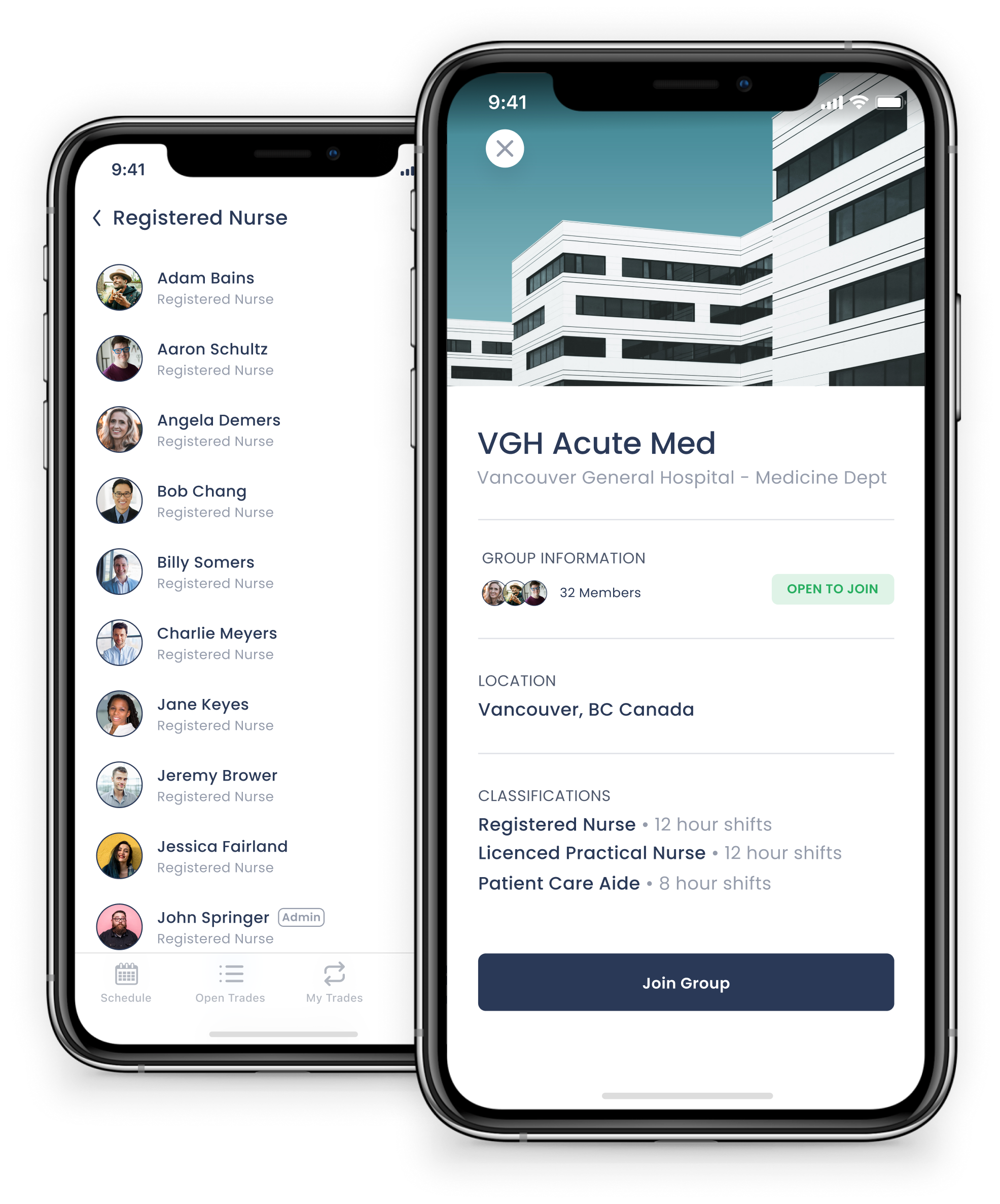
Find workplaces to join or create a new one if your workplace doesn’t currently exist in the app. You can view all your colleagues who are also in that workplace.
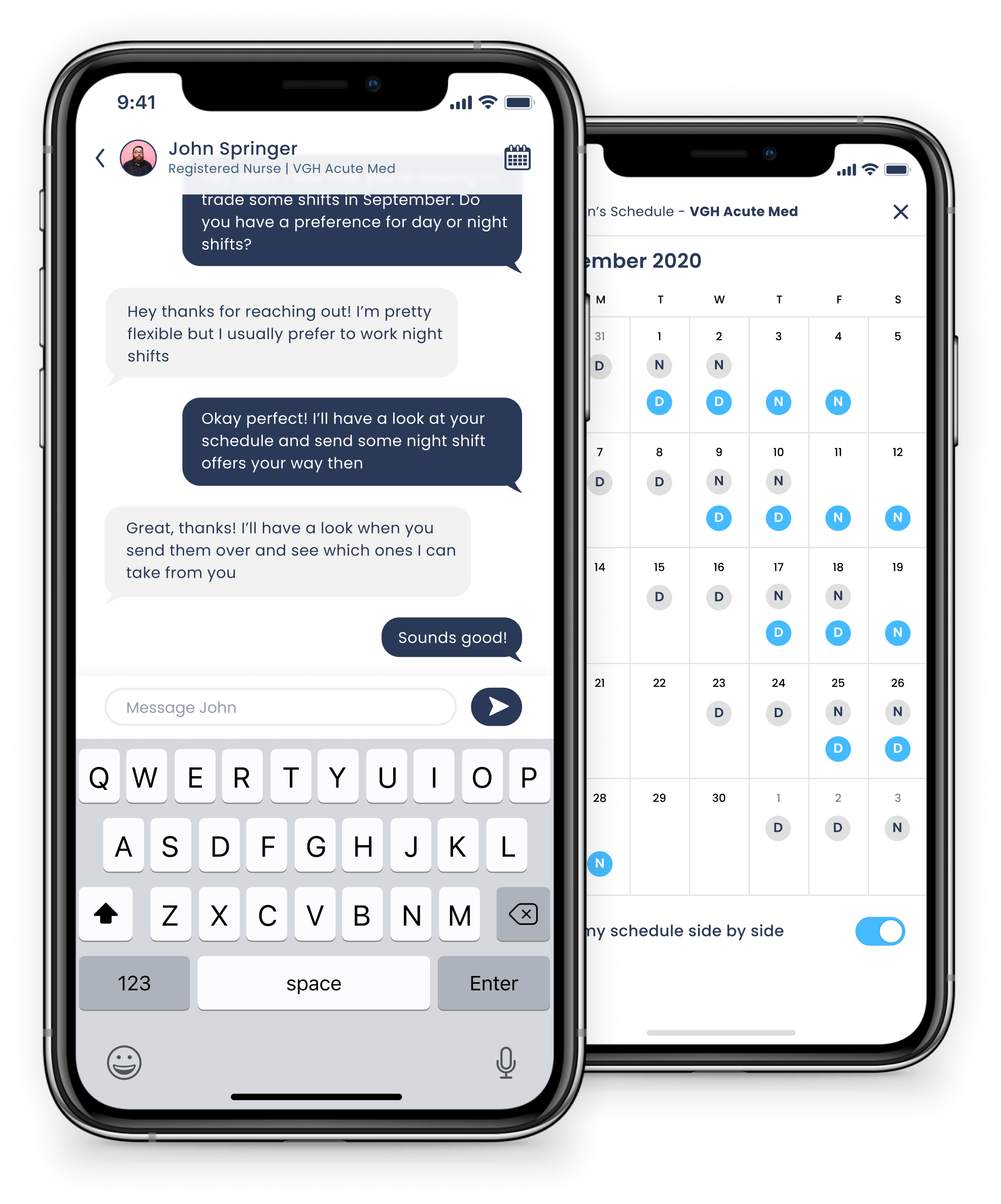
Built in direct messaging functionality allows you to reach out to others to enhance coordination of shift trades. You can also view their schedule side by side with yours to compare availability.
I am currently working with a small team of designers and software engineers to build a fully functioning version of the app, which is projected to be completed sometime in 2021. Once completed, I hope to trial the app with a number of users, make the necessary revisions based on user feedback, and eventually present my idea to hospital stakeholders as a viable solution to reducing scheduling errors and staffing deficits due to no shows.
This project was challenging but rewarding. Due to the complex nature of shift trading and the various different types of trades, displaying all the necessary information in a way that was easy for the end user to understand was difficult. This project highlighted the importance of utilizing user testing and feedback to inform my designs. I relied heavily on my colleagues’s input during the exploration phase to create an interface that would be intuitive and easy to navigate. Overall, the initial feedback I received from my colleagues was very encouraging. They all believed that this solution would be effective in simplifying and automating the process of shift trading.
.png)